Wow - it's all over but for the shouting! That comes tonight with the graduation ceremony for the Seniors at Northern Stage and then the Block Party tomorrow.
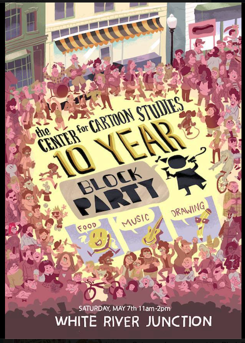
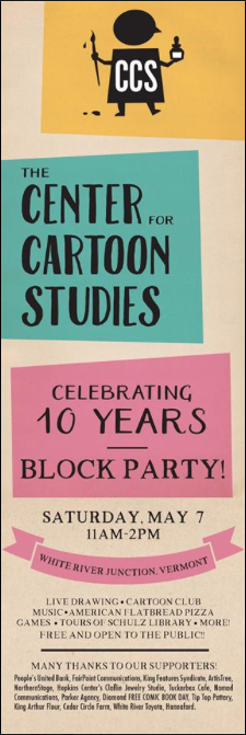
If you are in the area - be sure to come to the Block Party! Ed Koren will be there, free comic books, artist demos, live music... awesome! It's May 7th, from 11-2pm.
A quick aside...
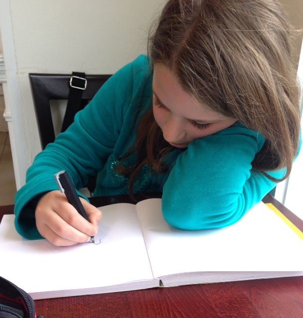
My kid and I have been spending a lot of time drawing comics in cafes...
And yesterday, the Kid competed in the Math League District Finals. Their final challenge was to invent a bug catcher...

These are all the Grade 3 Finalists from our school district. (She's second from the left).

OK - we now return to the regularly scheduled program...
Last week, we brought in our finished Mini-Thesis-Final-Projects and spread them out in the gallery (this is just half of them). Mine was the teeniest!
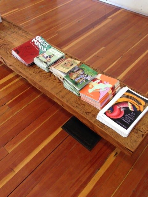
We filled up our boxes and took them home to peruse.
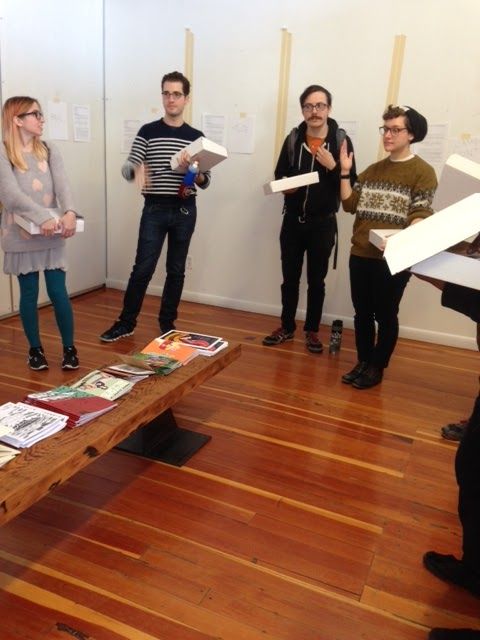
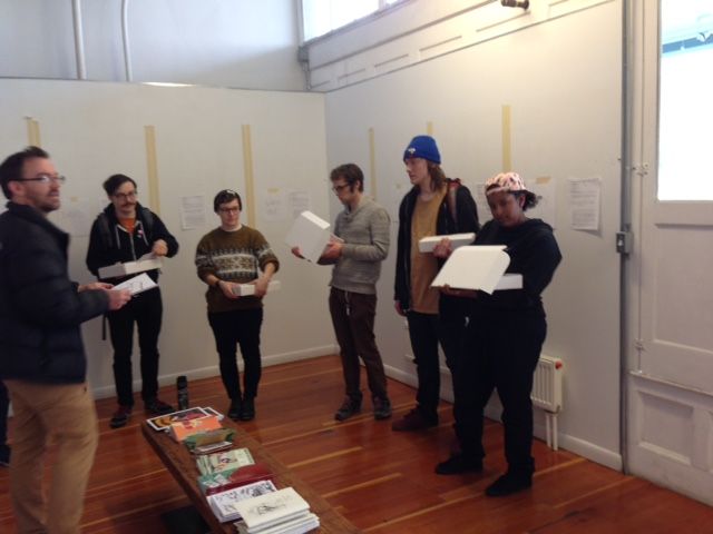
On Tuesday - we had our Final Crits. We each got about 30 minutes (It took almost 6 hours!) with 5 teachers discussing the merits and faults of the books. It was fascinating, nerve-wracking, and exhausting!
I was fortunate to be the first on the list, so I got the agony over with quickly. Then I spent the next five hours thinking of changes I could make to improve the dang thing!!
Those of you who are my Kickstarter supporters or subscribe to this blog, will be receiving an email with a link to the PDF of my project. I hope you get a chance to read it. And even better, send me some feedback!!
I took notes of what the teachers had to say and I'll write it out below. I'd love to know if you agree with their suggestions? Or if you have any others. I hope to do the edits and then get the book printed this summer.

Final Crit Notes:Good stuff:• Color, bats, good combo of spooky and Christmas• Love the faux old book look, good cover stock, nice feel• amazing technique with ballpoint pen, good grays, good quality printing• love how the pen looks like pencil• like the Intro inside cover and the Artist notes at the end• 95% of visual jokes work, ironic humor• Great little details (multi-legged stocking), fun to look around the pictures (bones on wall-paper...)• Good layout and page design, good use of comic panels• Cyclops snowman is greatSuggestions:• Trace over the typeset font so it looks like hand-lettering• Bumblebat on back cover looks out of place... maybe hand-draw with ballpoint too?• Facetrim (trim on right edge) is too close to margins - print on larger paper, then cut• 2 sleighs are confusing in first appearance. Need to see the entire sleigh (both of them)• Show tiny sleigh and reindeers landing, kicking up snow - that whole sequence needs more space• too many little panels and action crammed onto that one page (when reindeer appear)• 2 Santas are confusing• Add more detail to outside of castle - dead trees, dead vines, gargoyle...• Page with Frank looking out window, show him actually tearing off the shutters• add real canvas tape on cover• Add a "Window" on back cover (like the one on front cover) with a tranquil scene• Move copyright page to inside back cover, shift all pages up one and insert new page after reindeer land.
Subscribe to our email newsletter and unlock access to members-only content and exclusive updates.
Comments