Here's one of my own designs that will be in "the book." (Seems like some ominous music should play when those words are said...)
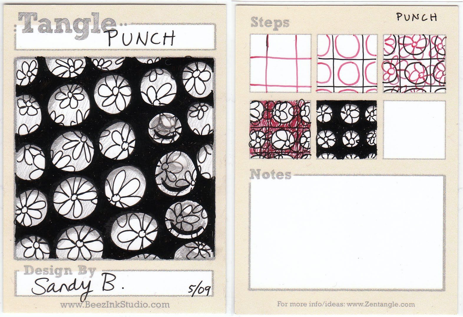
I like Punch because it looks super messy and some of my students start to panic (ye of little faith) and then, once you color in the black part, everything takes shape and makes sense. Kind of like life, eh?
The key to making it look 3-D is to put a little arc of pencil shading under the top edge of each circle. The idea for this Tangle comes from our visits to the Boston Childrens Museum. They had (have?) a Recycling Center with long strips of colored mylar ribbon that had been punched with circles to make confetti. It's cool stuff. So you can "lay" the punched ribbon over any Zentangle pattern, but I've found that the bigger and busier the pattern, the better it looks.
The slightly messy part on the right? I was experimenting to see if I could make it look like glass blobs were sitting on the flowers. I added a little highlight and a shadow, but I don't think it works very well on the black background. It needs a bit of shadow under the blob too and it won't show up on black. Ah well. That's the point isn't it? Experiment!
Subscribe to our email newsletter and unlock access to members-only content and exclusive updates.
Comments