[If you just want to see artwork and my homework - scroll down!]
We'll start with this photo my daughter emailed me.

I'm missing Halloween (and the kid!) and can't believe that I just raised my head - and it's almost a week into November! What?!
Alright, head back down...
Monday's Comic History was all about Burne Hogarth who became famous for illustrating the Tarzan comics, and Edgar Rice Burroughs, who created Tarzan.
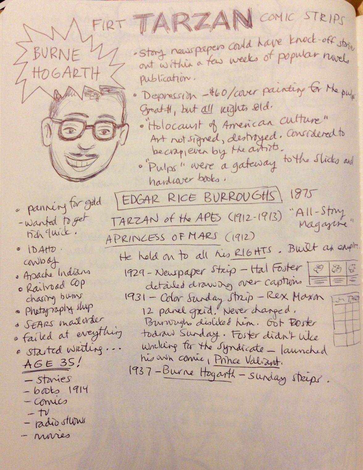
Edgar Rice Burroughs - good to know... he was a failure at everything he did... until he started writing - at age 35!
Smartest thing he ever did? Held on to all his rights!
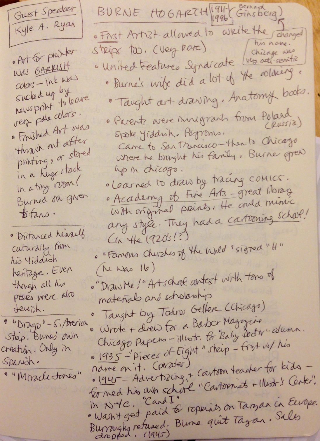
Burne Hogarth (I have even more pages of notes on him, but I'll spare you the agony) not only drew great pics of Tarzan, but he started the first cartooning school in New York City, called "the Cartoonists & Illustrator's Center."
C and I eventually became known as "the School of Visual Arts" (SVA) - I was so excited to learn about this as I attended SVA (a very long time ago...)! The rest of the story didn't go well though, as Burne Hogarth was one of the gazillion people targeted by McCarthy as being a Communist. At that time, almost all actors, musicians, artists, and anyone else with any kind of opinion - were "Communists" and blacklisted. Burne gave up the school, to his partner, Silas Rhodes, in order to save the jobs of the other teachers.
Burne then proceeded to write a whole bunch of books (Dynamic Anatomy, Dynamic Hands, Dynamic Light and Shade - you get the idea) which made his publisher, Watson Guptill, very rich. I learned to draw from those books too.


Burne Hogarth was the Father of over-accentuated super-hero muscle figures and his studies were used by programmers for all computer modeling too.
----------
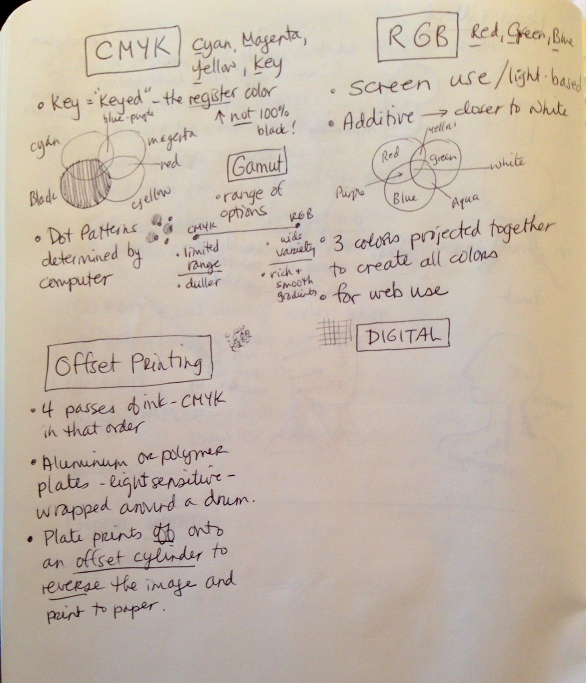
Yesterday, in Publication workshop, we learned about color! Finally, the mysteries between CMYK and RGB were cleared up.
The basics... RGB mode is Red, Green, Blue - the colors visible on a screen (tv or computer). They use light and when combined, form white. This mode should only be used for web design and images to be viewed on a screen.
CMYK means Cyan, Magenta, Yellow, and Key (Key is the main color that pulls the image together, usually black). CMYK mode is used for all things printed out. Printed colors are created by dot patterns, of those four colors, that are layered over each other.
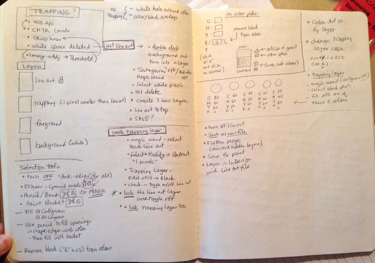
Then we learned all about trapping and how to color in our line work using layers in Photoshop.
Of course, I could have used that knowledge last weekend when I was coloring in my homework.
Trapping is a lot more complicated to explain, but it prevents white lines from showing around the line work where ink layers are slightly mis-registered. I'd be happy to give more detail, but I'm guessing 99% of you don't care. If you are geeky enough to want to know... you can study my notes (above).
Today, we learned about Osamu Tezuka - known as the Father of Manga (although Manga existed for 100 years before he began). Cool stuff about him... he was fearless and would tackle any subject in comics, break any rules, and integrate anything he saw. He was fascinated by early animation and used techniques employed by film, to show motion in his comics. He worshipped Betty Boop and Donald Duck (Carl Barks was a huge inspiration) - and drew all his characters with the same huge, wide eyes as Betty and Donald. This was copied by all future Manga artists and is now considered a Manga trait (big eyes).
Tezuka is best known (in the US) for his Astro Boy character, but was prolific (he drew over 150,000 pages!) and covered every topic possible from Buddha to Hitler.
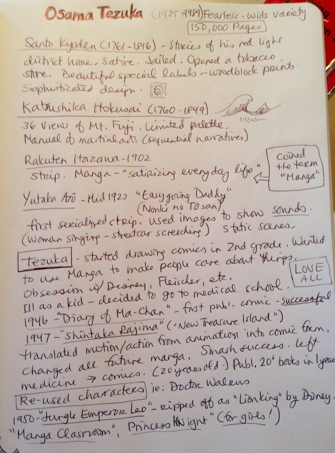
Tezuka also experimented with ways to communicate complex emotions and such things as... say... "existential angst" using lines and backgrounds. And "emanata" - which are lines and symbols radiating from characters and objects. You've probably seen the typical "sweat drops" to show anxiety or sunshine lines to suggest happiness or success?
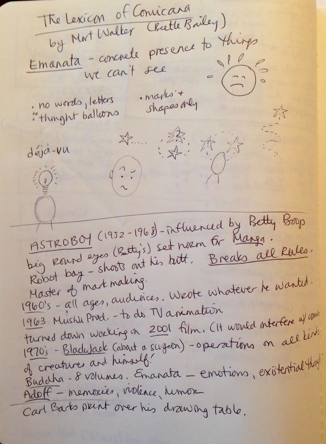
Our homework for next week is to do a comic page that explains a strong emotional situation, using no words or sound effects, just emanata, patterns and backgrounds...
---------------
Homework for this week was to illustrate an Aesop's Fable, draw Hair, and letter a scene from Macbeth...
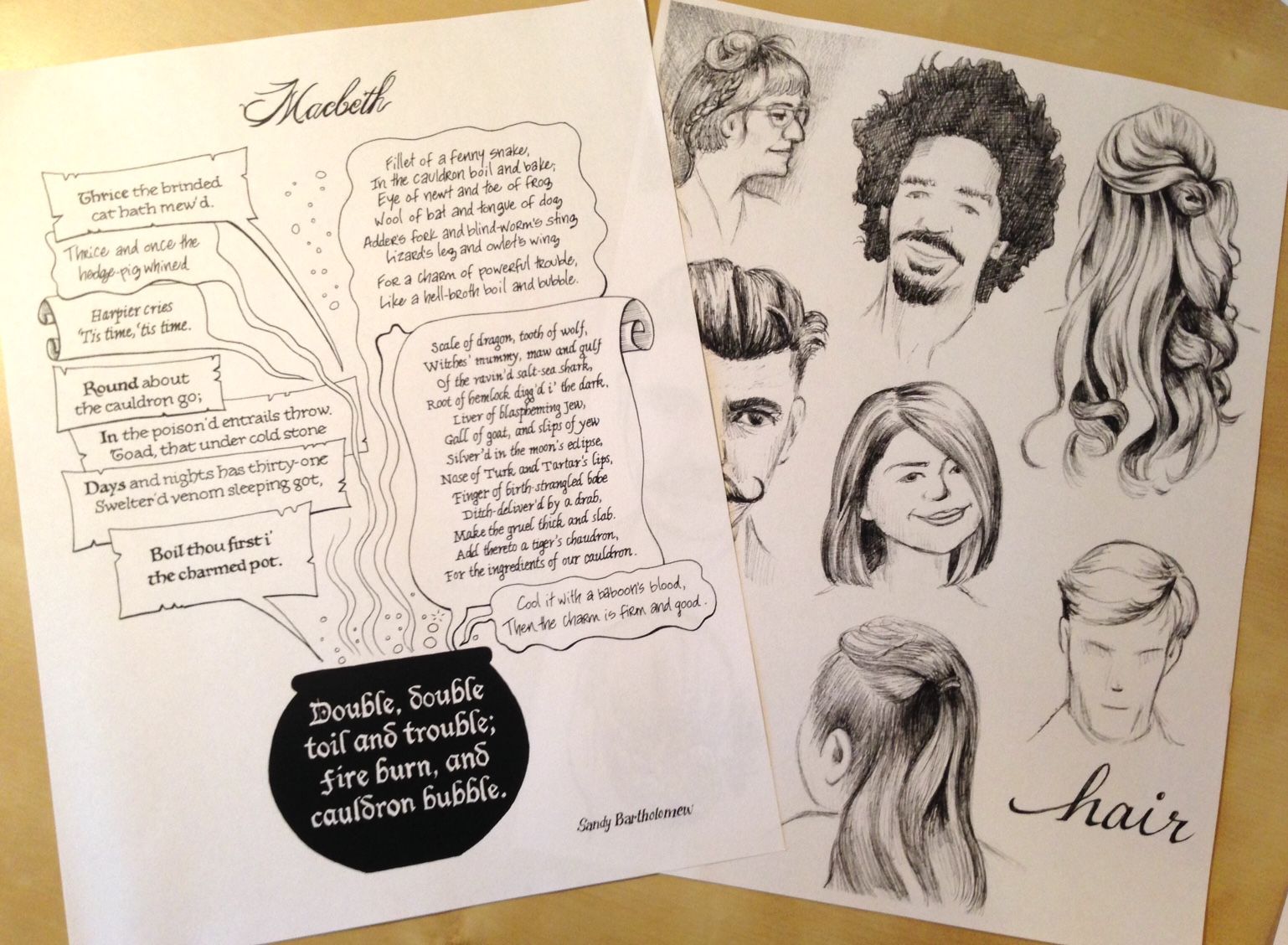
I love lettering and I believe that "anything worth doing is worth over-doing..." so I tried to show the characters (three witches) through their speech balloons and font styles. And I needed to add the pot. Because.
I did the hair sketches in ballpoint pen. I wonder why it took me so long to switch from pencil to pen? This is what I normally use to sketch with.
For the comic book, we needed to work with an Aesop's Fable and do an 8 page comic. Here are a few of the others:
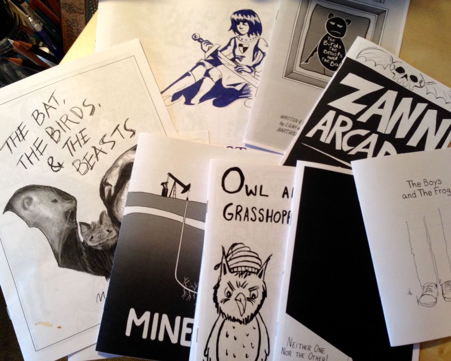
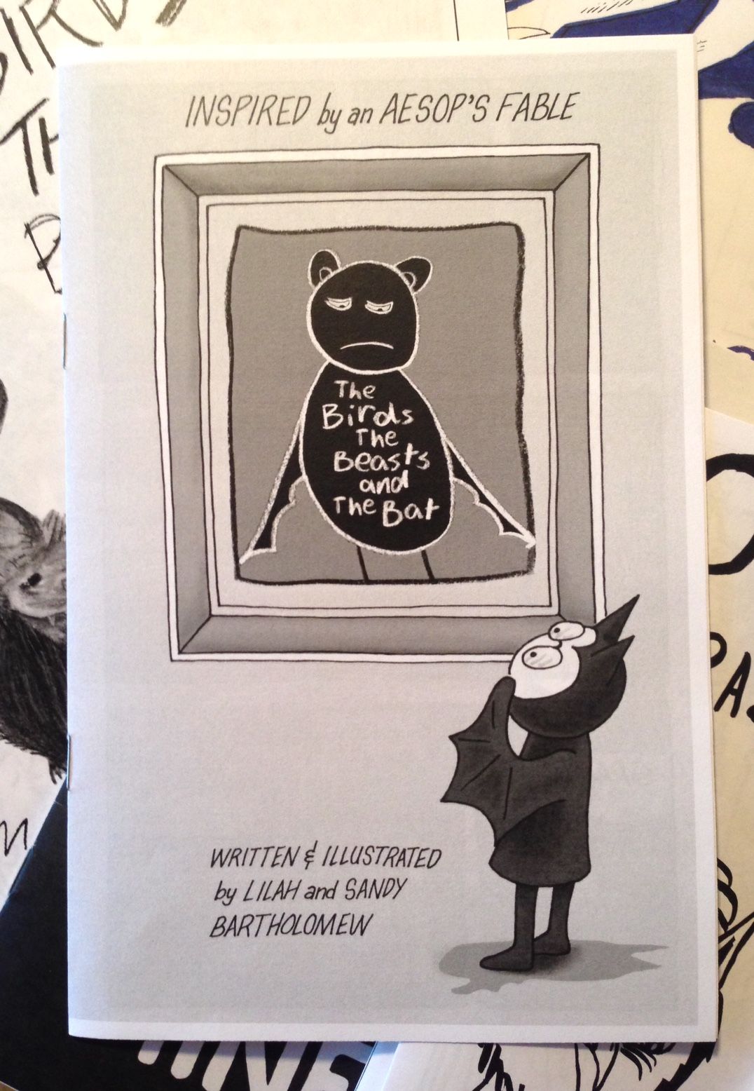
For mine, I chose The Birds, The Beasts, and the Bat. Which I hate. But then, I hate most Aesop's Fables. They are dumb and irritate me. But that's the beauty of this. Once you get past your own biases, you start thinking, "How would I have written it?" And then, you have a start.
I hated that the bat ends up living in the dark with no friends and doesn't fight the "Moral". Lilah helped me rework the story to make more sense and she helped me with the illustrations too. I have her original drawings on the front (title) and the back too. In critique today, they were the favorite part of the book! Lilah will be pleased.
For those of you who are Members of this blog, I will be emailing you a link so you can take a look at a pdf version of the comic. I hope you enjoy it!
Subscribe to our email newsletter and unlock access to members-only content and exclusive updates.
Comments